Data In Line Graphs Problems B and C
Some line graphs have separate lines for different items. By plotting different sets of data on the same graph, you can make a comparison between the sets of data.
B. The line included in the graph below shows the level of unemployment in a state over a sever-year period. Below are the corresponding unemployment rates for Middleboro, a major city in this state. Use a different colored pen, pencil, or marker to plot these points on the graph.
Unemployment in Middleboro:
| Year 1: 4.4% | Year 3: 9.3% | Year 5: 10.1% | Year 7: 7.1% |
| Year 2: 6.1% | Year 4: 12.2% | Year 6: 7.6% |
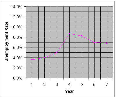
C. Use the line graph to answer the questions.
1. In which year did the state have the highest unemployment rate? ____________________________________
The lowest rate? _________ Is this also true for Middleboro? ____________________________________
2. In general how does the unemployment rate in Middleboro compare to the state's rate? __________________
3. Is the difference between the state's and Middleboro's unemployment rate always in the same proportion?_____
Explain your answer. ____________________________________________________________________
_____________________________________________________________________________________
_____________________________________________________________________________________
_____________________________________________________________________________________
| Click here to go to A |
Copyright 1997-1999: html adaptation
Career Connection to Teaching with Technology