Data In Line Graphs
Line graphs are useful tools for showing change over a period of time. Line graphs may show steady increases, steady decreases, or fluctuations. Whatever the pattern, the line graph gives a good visual image of what has been happening over a period of time.
In an annual report, the Lindell Corporation reported its net income over a ten year period. The information was presented in a line graph.
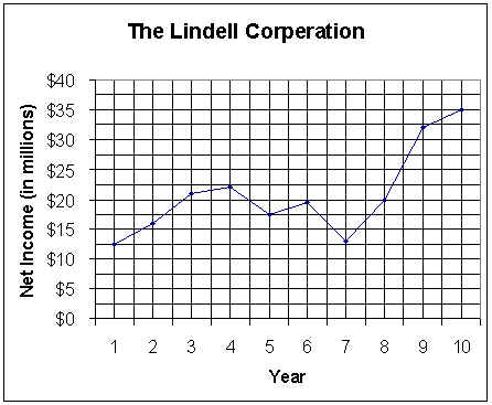
To read the graph, start with a particular year. Find the point on the graph that corresponds to that year. The look to the left horizontally of that point. Read the figures on the vertical axis for the net income.
A. Use the graph to answer the questions.
1. In which year did the company report the lowest net income? __________________________
2. What other year came closest to the lowest net income figure? _________________________
3. Between which two years did the company have the largest increase in net income? _________
The largest decrease? _______________________________________________________
4. How would you describe the change in net income over this ten-year period?
________________________________________________________________________
________________________________________________________________________
________________________________________________________________________
________________________________________________________________________
Click here to go to page B & C
Copyright 1997-1999: html adaptation
Career Connection to Teaching with Technology