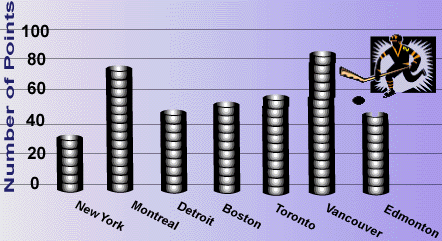
Bar Graphs help to make comparisons among several items in a given category. To make a bar graph, follow these steps below.
Draw two perpendicular axes on grid paper. Label each axes to identify the variables.
Choose a scale that will permit the full range of values to be graphed. Mark one axis with equal intervals.
Mark the other axis with equal intervals. These intervals do not have to match those used on the other axis.
Using the data values, carefully find the height of each bar for each item. Draw and shade each bar. Be sure to leave space between your bars.
1. Study the bar graph shown below.
a. What is being compared in this bar graph?
b. What conclusions can you make from the data show by the bar graph?
Line graphs are used to show the behavior of a variable. To make a line graph, follow the steps below.
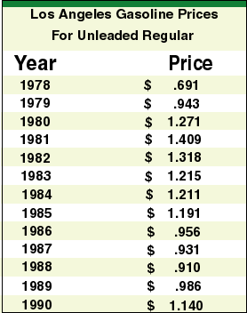
2. With your partner, study and discuss the following data.
a. Make a line graph of the data.
b. What is the year with the highest annual gasoline?
c. What is the greatest difference when comparing consecutive years? Why might it be different each month?
d. How can you use the graph to find the median? the mode? the mean? the range?
e. What is the overall pattern?
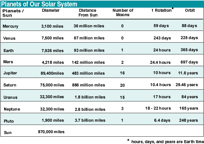
Using the information from the chart, make a scatter plot using the data from the two different columns in the solar system chart. Here are some ideas for scatter plots.
a. Are there any patterns suggested by your scatter plot?
b. Compare and discuss your results with other students. What are the most interesting relationships found? Why?
3. The table shows the winning times for every Olympic men's marathon winner from 1896 to 2012.
year
time
1896
2:58:50
1900 2:59:45 1904 3:28:53 1908 2:55:18 1912 2:36:54 1920 2:32:35 1924 2:41:22 1928 2:32:57 1932 2:31:36 1936 2:34:51 1948 2:34:51 1952 2:23:03 1956 2:25:00 1960 2:15:16 1964 2:12:11 1968 2:20:26 1972 2:12:19 1976 2:09:55 1980 2:11:03 1984 2:09:21 1988 2:10:32 1992 2:13:23 1996 2:12:36 2000 2:10:11 2004 2:10:55 2008 2:06:32 2012 2:08:01 a. Construct an appropriate graph for this data.
b. Find the three dates when there is no data. Why are these dates missing?
c. When did the greatest improvement in the winning time occur? Why do you think this is true?
d. What do you predict for the winning time in 1996? 2000? 2020?
4. Using newspapers, collect one example of each kind of graph you have learned about.
Mount the graph on a sheet of paper. Note the type of graph and it's source.
Finally, write a brief explanation of any conclusions you found from the graph.
Copyright 1997-1999: html adaptation
Career Connection to Teaching with Technology