This activity was developed by a student or students at Mainland High School which is located in Daytona Beach, FL. It is still a "work in progress" with editing and improvements yet to come.
In the table below are the latitude and mean high temperatures in April, for selected cities in the Northern Hemisphere. (The mean high temperature is the mean of all the high temperatures for the month.) Though in all of these cities temperature is measured in degrees Celsius, the temperatures have been converted to Fahrenheit.
|
|
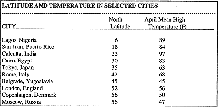
To graph the data points in the table, let the latitude be the x-value or the independent values. The y-value or the dependent value is the Fahrenheit temperature. Both units are degrees. For instance the data point for Tokyo is (35,63) Please draw the scattergram at this time.
The points on the graph suggest that the higher the latitude, the lower the temperature. What does the datasuggest for a city like Ouito, Equador, located at the equator (0 degree latitude)?
What would you predict for the temperature at a city at 19 degree latitude, like Mexico City or Bombay?
To answer these question, it helps to "fit a line" to the data. No line will pass through all the data points, but you can find a line that describes the trend of higher latitude, lower temperature. The simplest way is to take a piece of spaghetti and arrange it in an area that seems closest to the most points. It will not touch all of the points and it may not touch any of the points exactly. It will however be closest to the most points. After you have positioned the piece of spaghetti, use a ruler to draw the line. This is the "line of best fit.
Once a line has been fitted to the data, the idea is to find an equation for the line and then use the equation to predict temperatures for different latitudes.

Year 1984 1985 1986 1987 1988 1989
$26,433 $27,735 $29,458 $30,970 $32,191 $34,213
A. Graph the data and draw a line of best fit.
B. Model the data with an equation for the median family income in terms of the year.
C. Use your model to predict the median family income in 1999.
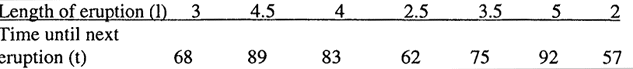
The length of time between eruptions of Old Faithful, a geyser in Yellowstone Park, can be predicted with a linear equation. The table gives some data values (in minutes) for the geyser's eruptions.
![]() 1.
Select a table of data to be used for determining a line of best fit. Please include the
source of this information in your presentation.
1.
Select a table of data to be used for determining a line of best fit. Please include the
source of this information in your presentation.
![]() 2.
Display the data in a creative fashion.
2.
Display the data in a creative fashion.
![]() 3.
Create a scattergram of the data. Be sure to identify the dependent and independent
variables, label the axis and title the scattergram.
3.
Create a scattergram of the data. Be sure to identify the dependent and independent
variables, label the axis and title the scattergram.
![]() 4.
Determine and draw a line of best fit for the graphed data.
4.
Determine and draw a line of best fit for the graphed data.
![]() 5.
Determine the equation for the line of best fit. Show all work for this computation and be
prepared to explain the computation to the class.
5.
Determine the equation for the line of best fit. Show all work for this computation and be
prepared to explain the computation to the class.
THIS PROJECT IS TO BE DISPLAYED IN A CREATIVE FASHION. YOU MAY CONSIDER USING A POSTER, REPORT OR A COMPUTER DISPLAY.
| MathSummer Activity
Summary Copyright 1997-1999: html adaptation Career Connection to Teaching with Technology |