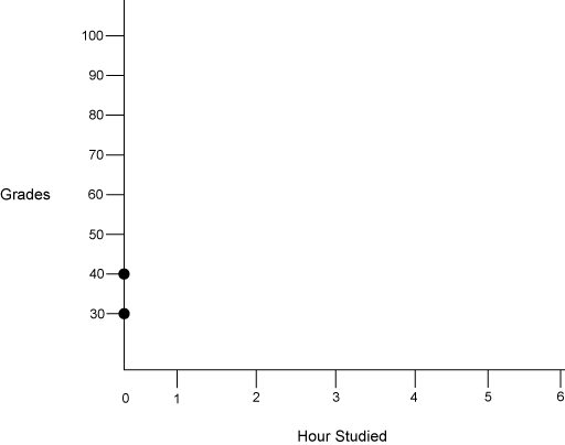
14. A scatterplot is a visual way of showing the relationship between two variables. Complete the scatter plot that has been started below.
Data Relationships
The table below shows the number of hours a student studied and the grade recieved on eight separate exams.
Hours 0 0 1 2 2 4 5 5 Grade 30 40 60 60 70 80 90 95
14. A scatterplot is a visual way of showing the relationship between two variables. Complete the scatter plot that has been started below.
14 a. On your scatter plot draw a line so that there are about the same number of points above and below the line. This is the line of best.
If the line of best fit slants upward to the right, there is a positive correlation between the sets of data. If the trend line slants downward to the right, there is a negative correlation.
For each of the following sets of data, what type of relationship might you expect (+,-, or none)?
14b. The weight of a sirloin steak and the selling price.
14c. The ability to surf and play the piano.
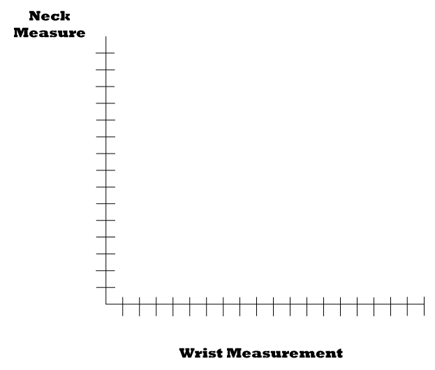
14d. Math anxiety and score on a math exam.15. Graph the neck and wrist measurements from your Data Collection Survey.
15a. Find the line of best fit.
15b. If Robert Waldo's wrist size was 24 centimeters, what was his neck size?
16. Assessment- each team must generate:
16a. A survey with two pieces of information They may or may not be related.
16b. For each piece of information, you must poll at least 25 people.
16c. Surveys will be exchanged between groups and the following will be turned in from each group.i. Chart- frequency chart (with or without intervals) or stem and leaf plot.
ii. Pictoral graph- Line plot, histogram or frequency polygon.
iii. Data chart with total number, least, greatest, median, mode, and mean for each.
iv. Scatter plot with the line of best fit.
v. An equation of the line.
Go back a page
| MathSummer Activity
Summary Copyright 1997-1999: html adaptation Career Connection to Teaching with Technology |